One way or another, every smart home device aims to make life more enjoyable. But often, these devices end up perpetuating pains they originally aimed to alleviate, or even heal, all because of disjointed user experiences. Take connected light bulbs for example. Where it used to take minimal physical effort and a single flip of a switch, simply turning off your lights now requires six steps. Here at Keen Home, we believe simplicity is a thing of beauty. That’s why creating a simple, seamless user experience (UX) has been a top priority to us.

For the past few months, we’ve been designing, refining, and testing the Keen Home app. We’ve been doing this over and over again because we want to ensure that when Keen Home Smart Vents are installed in a home, the owner has the clearest, simplest, and most enjoyable experience possible. This app is vital to the Smart Vent ecosystem, so we want to make sure it is as close to perfect as possible in both function and usability. We want you to not only understand how the Smart Vent works, but how you will interact with the vents and integrate them into their everyday life. To give you an idea of how we are creating the best user experience possible, we’re going to take you through our app development process, from beginning to end.
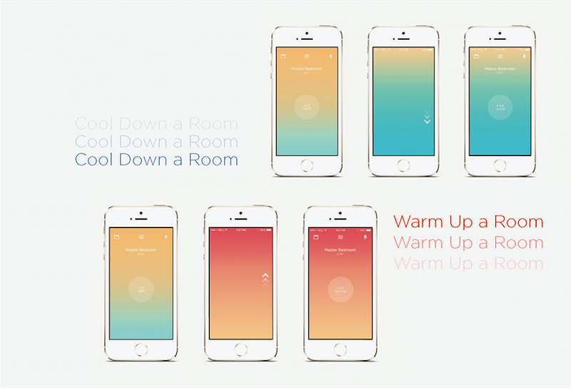
Let’s start from the beginning. You may or may not remember our early app concepts, but these designs opened our eyes to what we hadn’t yet considered. For example, the gradient of colors that were intended to be a visual tool for users to adjust the temperature of a particular room, ended up being a little brighter and bolder than we wanted.

In addition to modifying the aesthetics, we also realized we needed to update the controls interface. Originally, the experience of using the Keen Home app centered around the homeowner controlling the temperature profile of individual rooms (ie: how comfortable they felt in them). However, after running through design exercises and a handful of stakeholder interviews with customers, Keen Home founders, and the Keen Home team, we determined that this experience didn’t properly convey what was actually happening with Smart Vents.
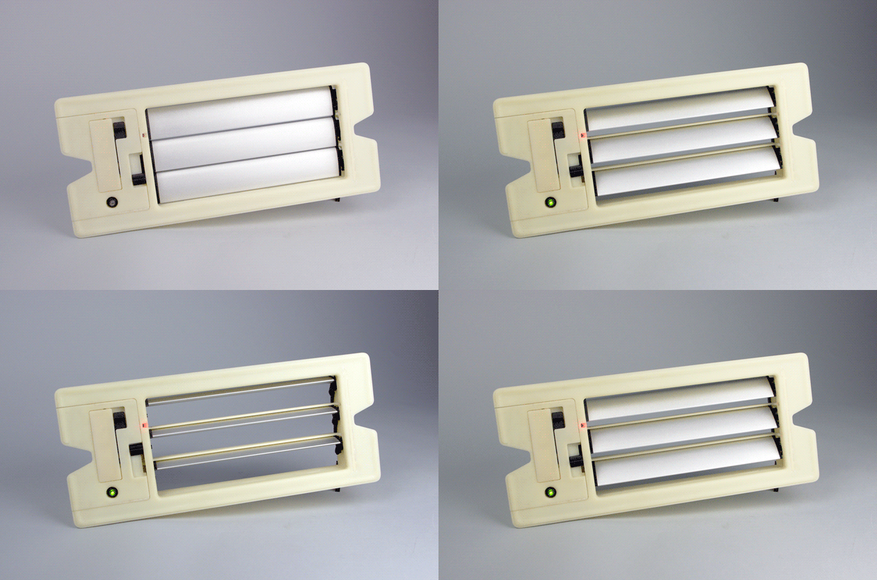
Rather than measuring the temperature of individual rooms, Smart Vents measure the temperature of air flowing into them. Taking these measurements allows the vents to determine how best to condition a room to meet a homeowner’s comfort preferences. Because of this, the homeowner is really controlling air flow rather than temperature.
Rather than measuring the temperature of individual rooms, Smart Vents measure the temperature of air flowing into them.
It may not seem like it, but this distinction creates an entirely different controls paradigm that, if not communicated well to the homeowner, can cause confusion. We knew we needed to change the experience and controls of the app to clarify how the Smart Vent actually functions.
Melding education and utility into 750x1334 pixels proved to be a challenge. To do it and create a seamless user experience, we established three goals:
Our app needed to
1. Clearly demonstrate the operation and function of the vents
2. Assist homeowners in determining the quantity and placement of the vents
3. Help homeowners understand the interplay between airflow and temperature

We wanted to make sure our ideas aligned with what users actually wanted, so we again sought outside perspectives. We met with stakeholders and surveyed the Keen Home community to learn what they want to accomplish with Smart Vents. From this research, we learned that homeowners want to control the aperture of the vents (how opened or closed they are) and to control the temperature of individual rooms. However, many didn’t realized that all of this relates to airflow. Our challenge became teaching how controlling airflow changes temperature, and what this means for placement of the vents.
Our challenge became teaching how controlling airflow changes temperature, and what this means for placement of the vents.
We’re easing you into it, starting with pure airflow control and working into regulating temperature with our beta flow-offset feature. With this beta feature, homeowners can tell the Smart Vents to automatically adjust airflow into a room to meet a required temperature adjustment. This is done by establishing the temperature in the duct when the HVAC is off as a baseline for the room. The vent then adjusts the amount of air it is letting into the room based on this base temperature, the temperature of the air flowing through the vents, and the angle of louver occlusion.
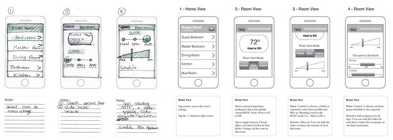
Once we felt we had a solid vision for the user experience and a way to achieve it. The next step was to bring the app to life. To start designing the whole experience — from the moment the app is opened to the moment it is closed — we first developed simplified user stories to illustrate what the user will see, what they need to be able to do, and the correlated instructions. These stories then allowed us to develop more complex stories to illustrate deeper interactions, such as the motivations users have for using the app and the first interaction they have in the app based on those motivations. Piecing together all possible user motivations, expectations, and interactions results in wireframe models. Wireframes create the skeletal framework and the flow of user experience in the app, and can be uploaded to simulation tools like Invision to test on a smart phone.

After completing the user stories and wireframes, we moved on to the actual design of the user interface (UI). Our Creative Director, Oscar G. Torres, turned to 3rd party apps and controls experiences to find the perfect aesthetic for our interface, referencing concepts as varied as the Nest app to car dashboards. To keep track of all these inspirations we set up a Pinterest board, which you can explore here. We experimented with many different designs before we felt we had something beautiful and workable on Invision. To see if others felt the same way, we once again turned to stakeholders and customers for feedback. After finalizing the UX and UI, it was time to prepare for coding.
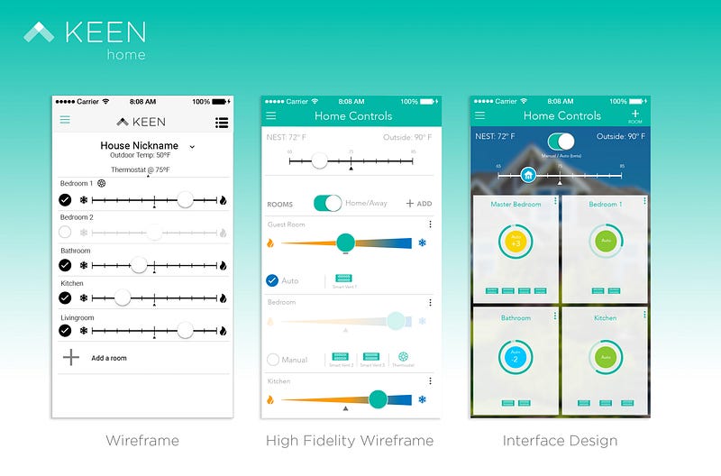
To ensure the mockups were pixel perfect for the development team, Oscar (also a talented developer) created high fidelity wireframes for them to reference. These high quality renderings of the app interface illustrated every detail and were as close as we could get to the finished product. To ensure data would be collected and distributed as envisioned, Oscar worked with Keen Home software engineer, Nir Levanon, to map out the Keen Home application protocol interface (API) endpoints. These endpoints connect the API to the app, and ultimately drive it and the Smart Vent, but we will get more into this in future posts. All of this has gotten us to where we are now. With everyone’s help, we’ve confidently handed off the high fidelity wireframes to the development team for them to bring the Keen Home app to life.

We still have some work to do before the app is ready, but as you can tell, a lot goes into designing a simple, seamless interface that translates physical realities into a digital experience. Through the design process, we learned a lot about how homeowners expect to control their comfort, and we inevitably made adjustments along the way. From the color palette to the controls interface, everything about the Keen Home app experience was prototyped, refined, and sometimes changed outright as we worked towards the finished interface. And it doesn’t end there. All of the work to code and bring the app designs to life is underway. We’ll have more behind-the-scenes glimpses at this aspect of app development soon.
Have questions about designing apps for proactive hardware? Hit us up on twitter @KeenHome or send a message to contact@keenhome.io.